Friday, March 23, 2012

Photoshop & Illustrator


                I would say that a lot of my work is varied. It doesn’t revolve around the same thing as some of my work. When I create, I try not to make anything too similar. I make sure nothing looks exactly the same. To teach myself how to draw, I would copy different types of pictures to broaden my horizons.  I learned not only how use different art styles, but also how to use Adobe Photoshop and Illustrator. 


            Apparently I am very good at both. In Photoshop I learned another way of improving my pictures.  I also learned how to create highlights and shadows coming from different directions. My people no longer look flat, as though it was attached to the page. The characters pop out of the page instead.
  

              I also learned how to change the colors of an original picture to a different a different color. In the picture of the girl above, everything but the feather in her hair was black and white. To get the rid of the words, I used the clone tool. Using the area around the words I was able to hide them. For the colors, I had to do the picture peace by piece and carefully layering everything each piece.


             In Illustrator I learned how to recreate objects. The perfume bottle was by far one of my best. I literally had to take apart the original and put it back together. When I finished I had some missing parts, but I had to give myself credit. It looks almost like the original. 

Thursday, March 22, 2012

Neji Hyuga


        http://www.youtube.com/watch?v=3Vp6H3J80_s&list=HL1332356903&feature=mh_lolz


            Neji Hyuga is my favorite character in Naruto. He’s serious, but not so much that it makes him seem like a bad person. In the first series of Naruto is mostly seen in a light tan shirt and black shorts. His hair long brown hair is kept back in a low ponytail. Neji’s right hand and leg are wrapped up in gauze bandages. On his head, he wears has two straps that come down to fame his face. Then in the second part his looks only slightly change. 


In Naruto Shippuden his hair grows a little bit longer. It is still kept back in the same ponytail. He still wears a white shirt, but instead this one is longer. His pants are white with instead of brown. Around his waist he wears a black wrap. Since Naruto Shippuden is a few years later from the first season, Neji got taller.

I do not exactly like how the artist made him look even more feminine. It makes him seem more like a female. I think they could have made him, if even, more masculine. They could have shortened his hair instead of letting it grow out. Even they could have made the clothes more masculine. Every time he moves, it looks like he is wearing a dress.
I might not like that he is feminine, but I’m not against it. It actually makes him look pretty; almost like a girl. If anything, I’ve always liked the pretty boys. They look cute on the outside. On the inside, though, they are usually one of the stronger people.


Tuesday, March 20, 2012

Lady Phantomhive


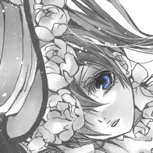
This video is filled with many pictures of Lady Phantomhive. She is a character in Black Butler, who usually goes by the name of Ceil. Ceil is in truth a male, who sometimes dresses like Lady Phantomhive to investigate. Lady Phantomhive is like Ceil’s alter ego.  She is sweet, while he is uncaring.
            Lady Phantomhive is mostly seen wearing a long pink puffy dress.  There are three bows on the dress. There is a big bow on the chest and two small black ones near the bottom of the dress. She also wears a pink hat on top of her head. Circling the front of the hat are pink roses.  Attached to the hat are white ribbons that wrap under her chin. Dressed as a female Ceil has two long pigtails that frame the face. 
            I’ve always believed that Ceil would have been better as a female, but after noticing his reactions, I realized he would be better off as a male. In the fourth episode, he whines a lot about being dressed as a female.  He has a hard time moving around in high heels. I think it is funny how he doesn’t like dressing up as a girl, but he cross-dresses a few times.
            To those that like anime, action and mystery I think you should watch the show.  I’m not saying that you’ll like it, but it is a good show. I actually find it very entertaining to watch.  The show is humorous and serious at the same time. Watch it. Maybe you will like it, maybe you won’t.

Kada & Bura


This is by far one of the cutest pictures by AishaxNekox that I have ever seen. The two chibi’s are adorable, especially Kada.  Kada has this cute innocence to her, while Bura is more out there. I like how the artist shows the difference between the two characters. It gives the audience the chance to understand different kinds of characters.
Kada has bright soft colors.  These colors balance each other out. Yellows, pinks, and, purples go hand in hand with each other. I like how AishaxNekox uses the colors in her hair. They use a gradient, so her hair isn’t plain. The hair changes from pink, to purple, to blue. They also use a gradient in the background from yellow to a hot pink.
Bura’s colors are also very similar to Kada’s. The difference is the types of colors used. The colors lean towards darker colors.  AishaxNekox use the color white so that everything isn’t dark. They try to keep the colors from being completely dark.  Too many dark colors are bad. They make everything seem depressing.
I love how they show light and dark in this picture. When I look at this picture I think of heaven and death. The lighter colors represent heaven. The darker colors represent death. Know matter how I look at it, I will always see this as light and dark.
I don’t like how the artist did the eyes. They don’t look like they match the characters at all. To me, they actually look kind of scary. They look too bright and shiny. AishaxNekox could have made the eyes less shiny.

Monday, March 19, 2012

Sailor Mars


I really love this picture by Naschi.  Not because of the colors, but more for the character. Her name is Rei Hino from Sailor Moon, an old anime that I use to watch. She was and still is my favorite character from the show. Rei is fierce and a bit bossy, but she has a very kind heart.

I also live the color. Red is by far my favorite color, which I believe describes my personality. I have always seen myself as very similar to Rei. Not too mean or too bossy, but enough for people to know when I’m not in a good mood. I am tough but not unbreakable.

The thing with this picture is that I think it represent Sailor Mars’ personality. The flames in the back are fierce, but not over the top. They show that she is a strong and calm person. She is most of the time anyways. Her expression shows that she is playful and maybe even a bit sneaky. I don’t like how they did the face. It is too childish and there is way too much blush on the cheeks. It’s almost as if they are saying she ‘s a kid, but in truth, she is not.

The movement of her clothes and the flames give off a wild feeling. It is almost like she is tame, but also not. This is very close to how she actually is. Rei sometimes jumps into action rather than thinking first. She prefers getting things done with quick to get back to what she was doing before hand. 

Friday, March 16, 2012

Red Beauty


What I love about Nanohikakou’s work is they make something small into something big. Nanohikakou doesn’t put al lot of detail into this picture, but they don’t leave it plain. I love how they make the girl look almost puppet like. The body is put together almost like a puzzle.  It is like the body of a puppet.
            I also like how the ribbon looks like it is separating. Part of the ribbon is on one side of the girl’s body. The other part of the ribbon is swirling down the page to the girl’s feet. The thing about the ribbon that I really like is the color. It’s dark enough to stand out, but not too much. I think the ribbon is supposed to bring the audiences eye to the girl.
            The part in the whole picture that I like is the girl. I love the way they did the pose. Despite the fact that it looks mechanic, it is very delicate. The fingers are long and pointed, but not overly pointed.  When I draw fingers for female, they are slightly rounded. For some reason, I can’t make females fingers as delicate as they should be.
            The dress really makes the body stand out. It fits tightly to the body, so it is not all over the place.  The little ribbons attached to the dress also attach to pretty wings.  The wings look a bit withered, almost dying, but they also come off fresh.  I think the fresh wings even out the slightly dead parts, like the left arm. I didn’t realize that until I really looked at the picture.

Thursday, March 15, 2012

Vocaloid Valentine


The thing about this picture, by Dav-19, that I like is that he put a lot of the things I like in it. I’m a big fan of Miku Hatsume and one of my favorite holidays is Valentines Day. When he put them together, it came out very beautiful. It never thought of putting my favorite things together. One of the things in this is how she makes the heart look like a pillow. The small wrinkles give it a frilly look.

 It’s not over the top, nor is there too little.  Dav-19 makes a lot of things pop out. I think she does it too much. In other words, she should tone it down just a bit. She should also get rid of the buildings in the back. It throws everything out of proportion and just doesn’t look right. To me, it looks like the artist put two different pictures together. Dav-19 should either change the background or just take them off all together.

I love how she did Miku’s hair, especially how she does the curves. I also like the coloring used. The darker areas like a bluish-green color, while the lighter areas look more like a sea green.  I do not, however, think that she should of made the bangs tan. The color blends too much in with her skin.  In her clothes Dav-19 darkens the area where the arms are. If she is going to do that, then she should make the boots and gloves light enough for people to be able to know where the arms and legs attach.

                                    Link:https://dav-19.deviantart.com/

Wednesday, March 14, 2012

Butterflies and Flowers


                    Caidychen’s art is what I would call simple and clean. It is not all over the place, and it is not plain. In this picture the artist used light colors that go together.  He uses pink, green, and yellow with very little blue. He also uses little details in small objects.

                    The details are mostly in the butterflies and leaves. He brings out the designs the wings. You can really see the design on the butterfly on her hand. The leaves have less detail, but enough to tell what they are. With the details, in the leaves, it makes the flowers stand out.

                    I also like how Caidychen makes the features of the girl soft. When I was looking at the hair, it reminded me of a waterfall. It looks like it is lightly falling down the sides of her face. I like the decorations in her hair. The wings look like little angel wings.

                    Small details like this can show what kind of person is being drawn. For the girl, the butterflies, wings, and flowers show that she is probably a sweet and caring person.  They can also show her delicate side.  In other pictures females are shown with delicate and rough features. Clothes, expressions, and their surroundings can show what kind of person they are.

                    The way Caidychen shows the girls expression is slightly confusing. The girl comes off either sad or happy. Since she could be expressing either, it makes it hard to tell what the expression really is. If showed only one expression, then it wouldn’t confuse anyone.

Tuesday, March 13, 2012

Pretty Warrior


The artist, Pheonixlu, makes the art have both realistic and fantasy features. I really liked how the face stands out in this artwork. Everything else is very wild and out there, but the face is calm, which tones down everything else.  I also like how they show movement in the weapon. It is moving a lost, but at the same time it is moving slow.

They also show movement in the clothes, which I had to give them props for. I still have problems with doing making clothes look like there is wind moving it. I don’t however like how the clothes and wind movement don’t go together. With the way they painted the art it looks like there is both harsh and soft winds, which through the picture slightly out of proportion.

I do, however, like how they put great detail into the clothes. They did most of the detail in the armor and bow; more the bow than the armor. It shows that they took time in making it. I also like how they didn’t leave the hair plain. To me, that’s boring and doesn’t bring anything to the face.

The small decorations in the hair keep it from being plain. They also give color to her hair. Speaking of color, I like how the art isn’t dark. The colors bring out a happy feeling, which could say that they were in a good mood when they were working on it. Seeing this, I figured that the colors in ones art shows how the artist felt while working on their art.

Monday, March 12, 2012

Midnight Church


The detail in this photo really brought the picture out. I really love how the artist, Licheus, makes certain parts blend in together. You can tell, just by looking, that they put a lot of time into this. When I draw I try and take my time, because I know that if I take my time it will come out how I want it.  The sky really caught my eye I when I was looking at it. You see all these tiny stars, then out of nowhere… BAM… one really big one.

There is however a few things that I do not like about the art. This picture is a bit dull, leaving it with very little color.  One is the girl that is standing up. For some reason when, when I look at her, she looks plain and doesn’t stand out. I thought the Licheus could have done more than leaving her hair in pigtails. The girl lying down stands out more, and you can’t even see her face. What makes her stand out is the color in her dress.

There is also a part near the top of the picture that had and still has me confused. It looks like a man standing on top of the build, but at the same time it could be a part of the building. In this, it does, however allow people to wonder and use their imaginations to figure out what it is. Even though is confuses me, I decided to leave it alone.